Hotels.com 2011 Hotel Price Index
This is a top-level summary of a much larger in-depth research report that Hotels.com publishes annually. An infographic is a great way to build awareness about your data and build credibility in the industry.


Northwestern University Center for Talent Development Pathways
This infographic is used to explain the concept of the Center for Talent Development (CTD) Pathways program at Northwestern University

Open Satellite Data
Open Satellite Data from RadiantEarth examines the open data portals made available by countries around the world

The View from Above
The View from Above infographic for Radiant.Earth serves as an introduction to Earth Observation Satellites

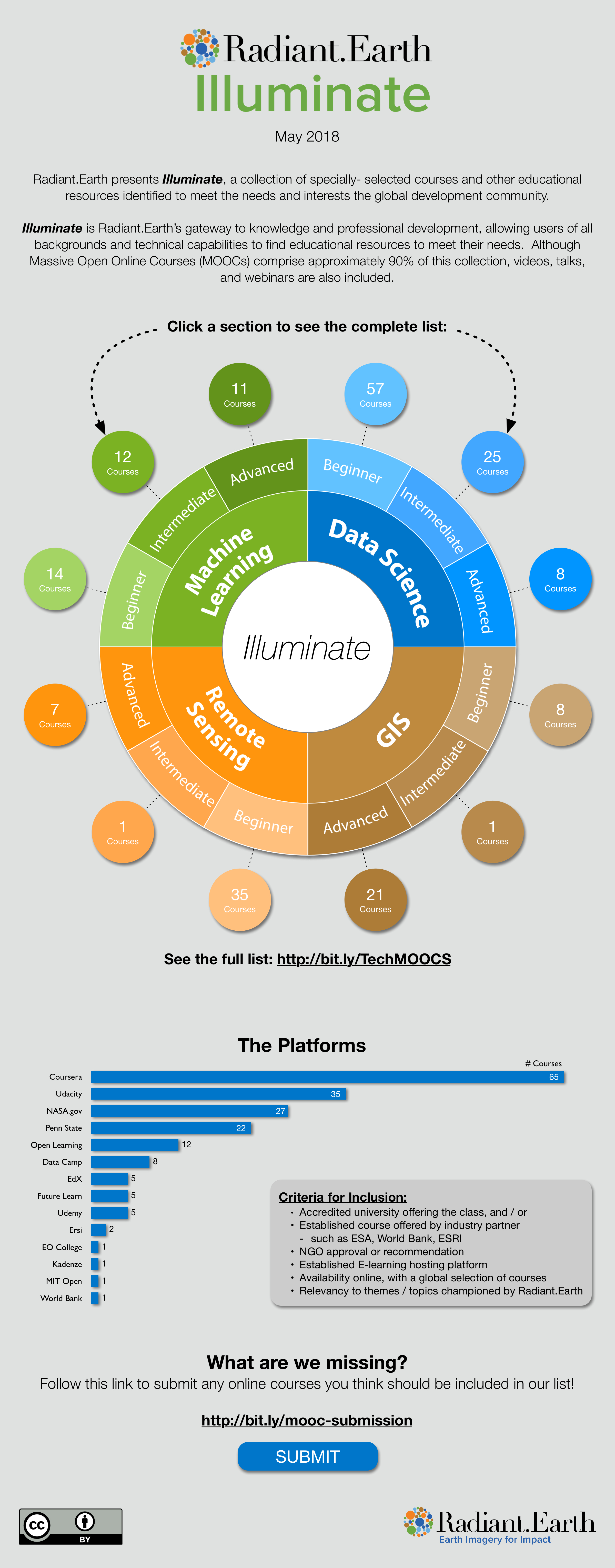
Radiant.Earth Illuminate
The Radiant.Earth Illuminate infographic highlights a collection of online MOOC courses available in the field of Data Science

Can Washroom Soap Make You Sick?
Persuasive infographic design for GOJO Industries that ties into an online petition campaign.

RothIRA Tower of Beer
Visualization of the scale and impact of saving for retirement when you start early in life for RothIRA.com.

DPMC (Data Protection Management Console)
DPMC Data Protection for the Dell EMC XC Series infographic designed for Cloud Evolutions

Covance Companion Diagnostics
The Covance Companion Diagnostics (CDx) infographic was designed as part of an overall marketing campaign

What's Your Ideal Workplace?
Whats Your Ideal Workplace? Infographic designed for Quill.com

Gymkhana: The Infographic
Joint project with the design team at DC Shoes to create this infographic of the history of Ken Block's Gymkhana videos on YouTube.

Kelly Slater: Greatest athlete of all time?
Joint project with the graphic design team at Quiksilver that looks at the many accomplishments of Kelly Slater's surfing career, and compares them to prominent, famous athletes from other sports.

Humanitarian Drones
The Humanitarian Drones infographic for Radiant.Earth outlines many of the regulatory challenges for using drones in humanitarian efforts around the world.


Hotels.com 2012 Romance Survey results
Our 2nd project with Hotels.com to tell a visual story using their own consumer survey data

Hotels.com 2013 Amenities Survey: What Guests Want
Part of the ongoing series of infographics for the Hotels.com Press Website, visualizing executive summaries of the their research data targeted to Executives and the news media.

Research Now Mobile Health Apps
Using their own survey data, Research Now shares industry information about the growing market for mobile health apps on your smart phone.

Search Engine Complexity
What's So Hard About Search? designed for SEO expert Eric Enge from Stone Temple Consulting, this infographic gathers data from a number of ellusive and different data sources to help paint the visual picture of how amazing our current search engine capabilities are, and how the challenges are growing rapidly.

The Lifespan of Storage Media
Fantastic informational design for CrashPlan.com that summarizes the normal expected failure time for many of the most popular media types to store data, photos, audio and video.

The Visual History of Christmas Trees
The Visual History of Chrsitmas Trees is dsign with a long Online Lifespan for Chistmas Tree Market. The design will continue to be relevant for many years to come.

Solar Savings, A Solar Innovation Story
If you're doing something good, you should shout it from the rooftops! What is the impact to customers and society from your internal projects? This design for Extra Space Storage was used to communicate to shareholders and customers the statistics behind their solar power initiative.

Wealthfront Avoid the Dip
This design for Wealthfront shows data gathered from 254 technology IPOs, and the immediately price dip the day after the lockup expires.

Most Polluted Cities 2012
First in a series of design for the American Lung Association in coordination with the 2012 State of the Air report.

Taking Action for Clean Air
Part of a series of design for the American Lung Association in coordination with the 2012 State of the Air report.

Health Effects of Dirty Air
Part of a series of design for the American Lung Association in coordination with the 2012 State of the Air report.

Mobile Youth: Teens and Cell Phones
Colorful infographic design for PrepaidPhones.com based on research data

Kitchen Trends for 2016
Kitchen Trends for 2016 infographic designed for The Home Depot and published on The Daily Meal

Texas Energy Waste
Put your data into context. This design for ChooseEnergy.com answers the question: What do the savings mean personally to the readers?

Streamlining your Digital Life with the new iPad
Design for Nextworth for the launch of the New iPad in March 2012

History of Christmas Traditions
The History of Christmas Tradition infographic timeline design for Balsam Hill shows how events from multiple timeline categories have converged into the modern day Christmas holiday.

Power Hungry
Power Hungry is the history of power consumption over the last 100 years. Designed for Home Depot, the infographic was published on Inhabitat

Voice is King
Our 2nd design for Nuance Communications. Mobile consumers want voice control! An infographic is a great way to show potential customers why they need your product!

The Mobile Advantage
Design for Nuance Communications looking at how strongly mobile apps can influence a brand's reputation with consumers.

Branch is the Cornerstone
Design for Prime Performance that shows why branch offices for banks are so crucial to their brand and customer satisfaction.

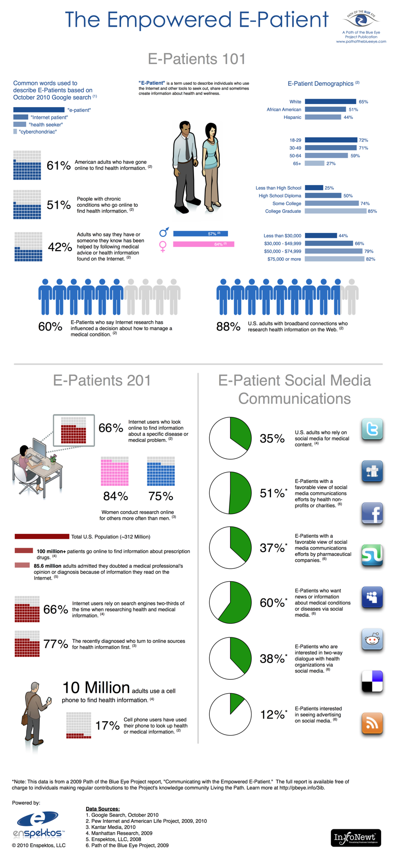
Facebook: Privacy and Health
Use an infographic to share the unique data that you have about your specific industry, and build your credibility as a market leader. This design for Enpektos is very specific to health information on Facebook.

Panaya SAP Fact Sheet 18
Help your customers and readers understand very complex systems by visualizing them in context. This design for Panaya, summarizes the recent changes to SAP software included in Fact Sheet 18. It's publicly available data, but shared in an easy-to-understand, engaging way.

So Nice Organic Choice
Use an infographic to tell your story to customers, and why your products are different. This design for So Nicesoy milk is used on their website and as a printed piece at consumer trade shows.

The History of Swimwear
The History of Swimwear is an infographic timeline for BackyardOcean.com that visually shows the evolution of swim suits over the last 150 years.

Christmas Drinks Around the World
Christmas Drinks from Around the Globe was a fun design project for Treetopia.

Finding the Productivity Sweet Spot
Design for NICE.com that tells the story of how employees waste their time at work, but reveals that there is an ideal balance of personal time at work for the most productive employees.

U.S. Motorcycle Helmet Laws wallet card
Project for both the original infographic and the smaller wallet card map visualization for motorcycle riders across the country. FREE wallet cards are available by request at the Buckfire & Buckfire site.

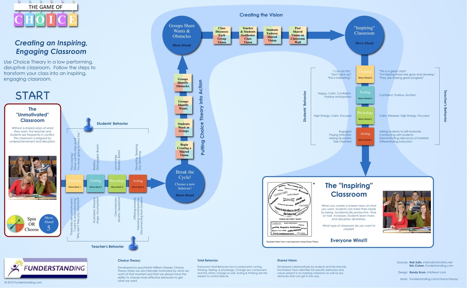
Using Choice Theory in the Classroom
A gameboard-style design showing a process with manys teps along the way. Funderstanding does a good job of using the infographic as a tool to gather contact information on their site.

Sudan Bombing Infographic
This Sudan Bombing Infographic for Eric Reeves was designed to summarize the scale of the recorded bombing attacks in Sudan over the last 12 years.

Work at Home Scams
Provide valuable information that educates and informs your readers. This gives them reason to return to your site frequently and engage with your business.

Top 20 Marketing Automation Software Solutions
Have you gathered data in your industry/market that would appeal to your customers? As an informational piece for customers, this design for Capterra summarizes the Top 20 Most Popular Marketing Automation Software Solutions based on their own internal calculations.

Top 20 Medical Software Solutions
2nd project with Capterra analyzing the most "popular" software for a specific category.

Poverty in America
Use infographics to share news that is interesting and appealing to your readers. They would prefer to view your infographics than read long articles like this design for BuildDirect.

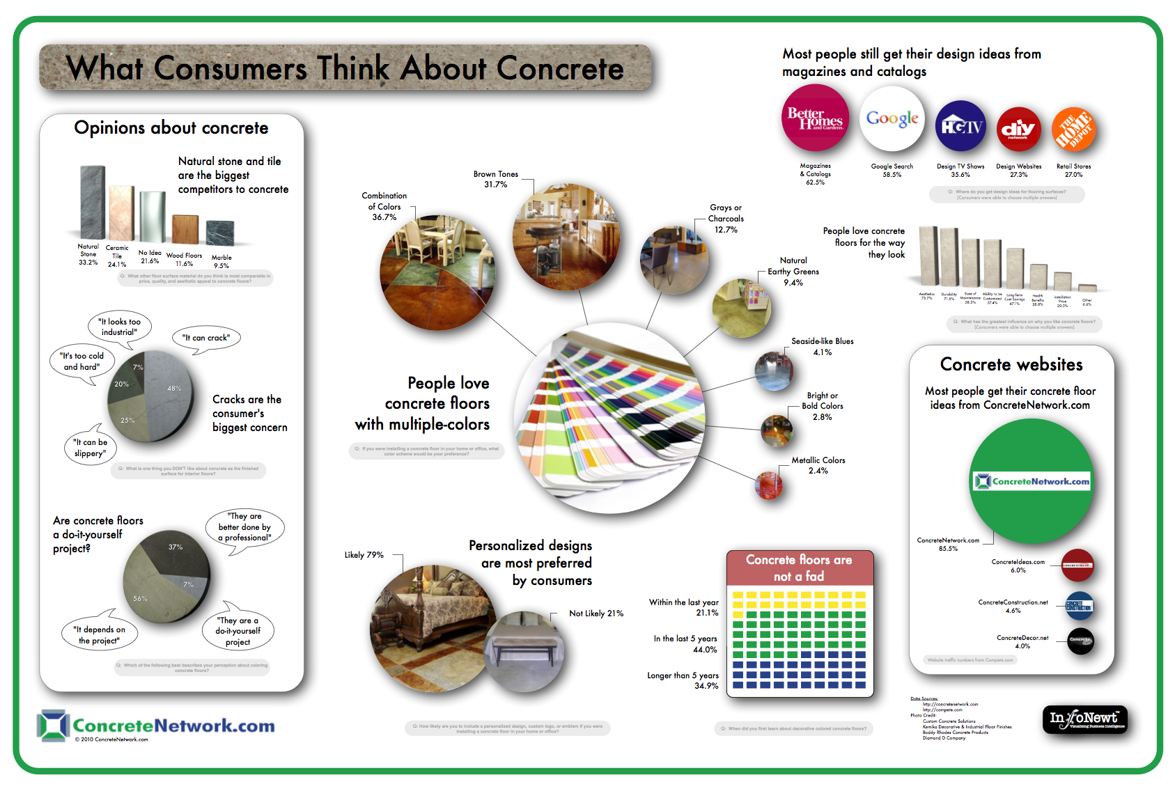
Concrete Floors
Visualize the information that your customers are looking for, and build your credibility as the expert information source in your field. They will share your information on the Web, spreading your brand to more potential customers.

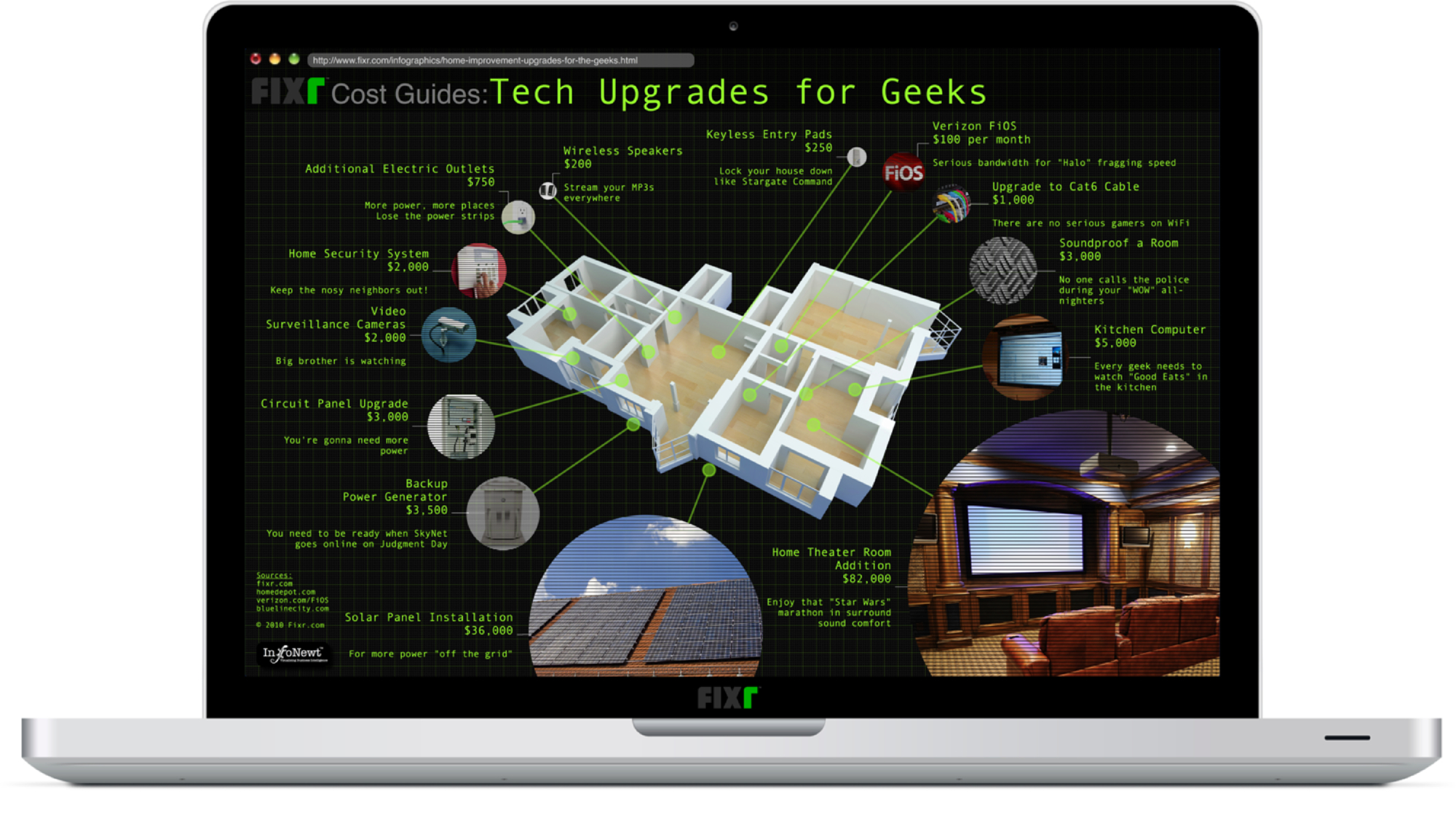
Geek House Upgrades
Fun infographics can entertain readers while also providing links directly to your site and services.

Wine iPhone App Spectrum
Don't publish lists. Use a visualization with brand icons/logos to make your information interesting and shareable. This design for VinTank also makes each of the icons clickable links to the iPhone app for the reader.

Wine iPhone App Statistics
Use an eye-catching infographic to share an overview of your research data, like this design for VinTank that summarizes the state of wine-related iPhone apps.

2011 SAP Salary Survey
Use an infographic to visualize the key findings from your research to appeal to readers and build awareness of your services for potential clients. This design for Panaya summarizes salary research for SAP professionals.

Keith Bates Infographic Resume
An infographic resume design for Keith Bates' consulting website. Used as navigation for the front page content with clickable regions to other pages on his website.

10 Things You Probably Didn't Know About The iPhone
Infographic about the history of the iPhone for NextWorth, used as content leading up to the release of the iPhone 5S and 5C.

Research Now Big Game Mobile Survey
Research Now fielded a survey on mobile devices during the 2015 Super Bowl, and published their results in this infographic the next day.

Identity Theft 911 infographic profile
Identity Theft 911 uses this infographic on their About page to demonstrate their company growth

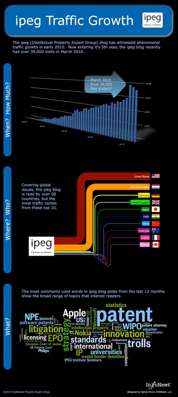
IPEG Website Traffic
Visualize your website statistics to help demonstrate your reach to advertisers, attract authors and track the impact of your Marketing initiatives.

Good News for Online Degrees
Visualize publicly available data as it relates to your business to put it into context.

Overtime Pay Laws for Call Center Employees
https://www.overtimepaylaws.org/call-center-overtime-infographic/

Honda's 1 Millionth U.S. Export
This infographic for Honda America was used as part of their celebration of the 1 millionth Export from U.S. Manufacturers

Colic Calm Growth of Infant Prescriptions
Are Infant Reflux Drugs Worth the Risks? infographic designed for Colic Calm

The Millenial Dilemma


