How Affiliate Marketing Works infographic
Designed for Sugarrae.com, the How Affiliate Marketing Works infographic is a visual explanation that took a 10-step process and turned it into a visual story with three color-coded characters. By visualizing what was a text bullet list, the end result was much more popular, memorable and engaging to the audience.
Now available for purchase as a poster.

Honda Accord: 30 Years of American Craftmanship
This infographic PR banner for Honda America was used as part of their promotion activities supporting the release of the new 2013 Honda Accord. These 9ft banners were on display at PR events in cities all over the country through August and September.
Read more about the design process on the InfoNewt blog.

Southern Gas Association Service Award Poster
This timeline history of the Southern Gas Association was given out to over 500 volunteers serving on approximately 50 committees and interest groups.

McGraw-Hill LearnSmart poster
This design covers the research and statistics behind the LearnSmart product offering from McGraw-Hill.

2009 Budget Poster
A bubble map can be used to show large amounts of quantitative data broken down in different ways. Budgets, sales figures, inventories, shipments, time spent, website statistics and more.
This poster serves as an example of visualizing a complete budget using proportionally sized circles. Understandably, the companies I have done this type of design for consider this their information highly confidential, which makes sharing the final designs impractical. Using a local city budget as the data source, I use this design to demonstrate what can be done with corporate data.
The left side shows all of the sources of income, and the right side details all of the expenses. The connecting line and circle border colors represent whether that line item has changed favorably (green), unfavorable (red) or has remained the same (yellow). This one-page poster is a complete summary of the original 68-page source document released by the city of Bedford, TX.
This style of visualization design can break down information about sales & profit by product lines, company departments, customers, office locations and more.

MHPM Corporate Sustainability Report
MHPH's Corporate Sustainability Report was designed into a poster that contains the complete report and meets all of the required reporting guidelines.

The Caffeine Poster
How do your products compare to the competition? Don't tell your customers why you're different...SHOW THEM!
You are what you drink. With so many drinks today claiming to be “energy drinks”, I wanted a little visual clarification, so I made The Caffeine Poster. With coffee drinks on one side and canned cold drinks on the other, you can quickly see how much of a caffeine “hit” (in mg) you will get after consuming. What’s especially interesting is many of the drinks have a very high caffeine mg/oz ratio, but the drink is so small you don’t get that much total caffeine.
THANKS: A big thanks to Fast Company for posting about The Caffeine Poster on the Fast Company blog. The Caffeine Poster was the most popular story of the week on Fast Company!
I wrote a Making of the Caffeine Poster series of blog posts, that I have compiled HERE.
I had a number of these printed out by request for teachers and health professionals, and this poster is hanging up in a number of schools and health offices.

FDA The Tobacco Control Act timeline
A collaboration project with Enspektos and the FDA: Center for Tobacco Products to layout a timeline of actions outlined in The Family Smoking Prevention and Tobacco Control Act.

Dade Paper Overview Trade Show Banner
Infographic overview of Dade Paper in recognition of their 75th Anniversary. This is a good example of using an infographic to tell the story about your company, and they also made it into a retractable trade show banner and available as a PDF download.

Visual History of Halloween
Infographics of fun, interesting topics related to your business are much more likely to be shared and don't feel like advertisements to the readers. This design for FrightCatalog.com drives traffic in October every year, which was the whole point.

My Digital Life 2.0
Profile your target customers by mapping their product experiences. Based on consumer research, map out the products that your customers use, including both your products and the competition. Use this tool to target your new products and understand how they will integrate into your customer's lifestyle.

2010 Bedford Budget Poster
Bubble maps can also highlight specific areas of discussion. This poster was displayed in city council meetings during the budget approval process to highlight the new items included in the budget proposal.

The Nametag Manifesto
The Nametag Manifesto infographic poster was designed as the companion piece for the Nametag Manifesto PDF book from Nametag Scott.

Idea To Exit: The Business Journey
Poster-sized project mapping out the complete lifecycle of a business. High-resolution version with zooming viewer avilabale at ideatoexit.com

McGraw-Hill CONNECT poster
This design for McGraw-Hill shares some of the stats behind their CONNECT online education system, and was printed out as a poster for their annual sales meeting.

Online Conversation Map
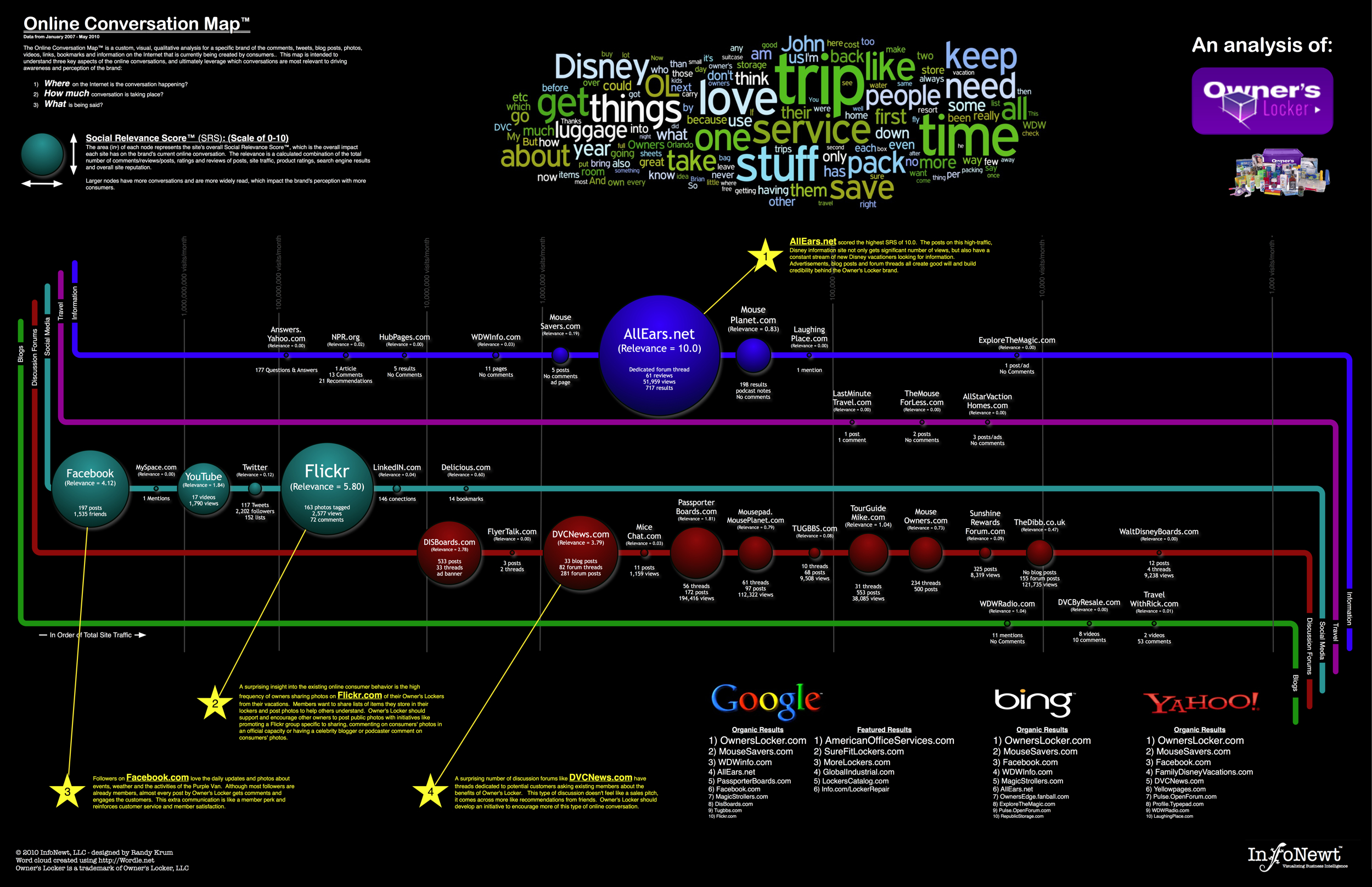
The foundation of any online marketing strategy should be understanding where conversations are already taking place about your brand, service or products. The Online Conversation Map is a custom poster based on thousands of posts, comments and ratings about your brand.

Online Conversation Map Owner's Locker
The Online Conversation Map is a custom poster based on thousands of posts, comments and ratings online across multiple sites and channels about your brand.

IFDA Lobbying Banner
16ft banner used for Lobbying in Washington DC produced for the International Food Distributors Association (IFDA)

IFDA Lobbying Banner
16ft banner used for Lobbying in Washington DC produced for the International Food Distributors Association (IFDA)


