
Infographics in a PR Strategy
Hotels.com is a company that has embraced infographics. We have designed a number of infographics for them specifically for use on their Press website. They are so committed to infographics as an ongoing part of their PR strategy, that they have created a dedicated infographics page on their press website.
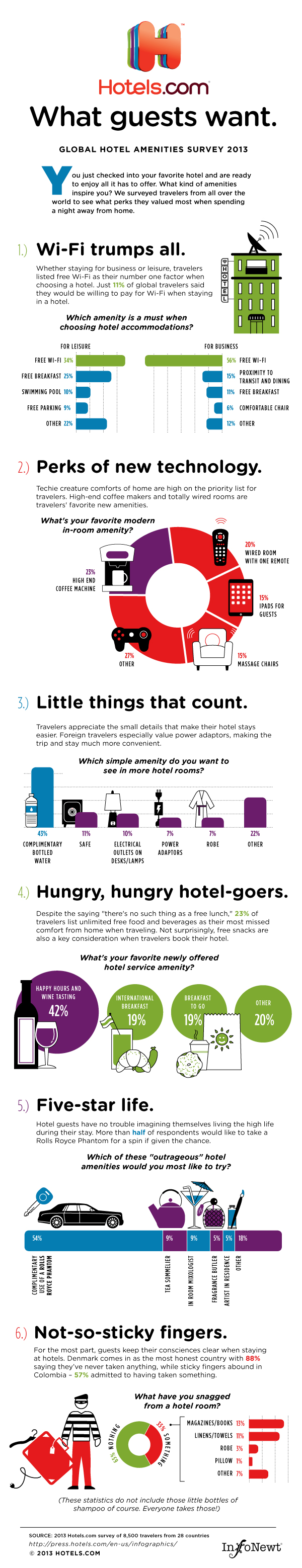
They just published the 2013 What Guests Want infographic, an additional content piece to the release of the complete survey, Global Travelers Want To Stay Connected And Comfy. The Hotels.com press site is primarily targeted at an audience of hotel industry executives and the news media. The addition of the infographics to the press releases helps to make the often dry survey data more engaging, and additional press releases were also published to highlight some of the hidden gems in the data: Danish Hotel Guests Most Honest; Americans Come In 23rd Place
I asked the Taylor L. Cole, Director of Public Relations & Social Media at Hotels.com a few questions about their strategy, success and experience using infographics to support their PR content.
Randy Krum: How do infographics fit into your content strategy on the Hotels.com press site?
Hotels.com: Infographics are a great way to visually represent the wealth of data we have available as an e-commerce site and from our own customers. We use them to put a fun spin on and break down more data-heavy subjects like the changes in hotel prices around the world year-over-year or to release consumer survey results on topics like favorite hotel amenities. We've found the media likes to have a choice of a written or visual story.
Randy Krum: Who is the primary audience for the infographics on your press site?
Hotels.com: Media of all forms - newspapers, bloggers, online sites, TV stations. Additionally, our hotel partners use our infographics for further insight into the opinions of travelers and trends in the travel industry.
Randy Krum: Hotels.com has been using infographics on their press site for two years now. What have you learned about using infographics effectively with your audience?
Hotels.com: The simpler, the better. A very clean design with easy to follow lines has worked best. If the data to present is too complex or doesn't naturally flow the way one's mind make certain jumps to information, we find it best to present the data in two smaller graphics. We've also found that media and our consumers are responding favorably to our infographics with icons like piggy banks, bed pillows, the universal Wi-Fi symbol and the like.
Randy Krum: Do you find that your message is spread farther because of the easy sharing nature of infographics?
Hotels.com: Absolutely. Infographics have become like a bragging right to see who has found the coolest designs and information to share with their friends and readers.
Thanks to Taylor and Hotels.com for their time and willingness to share their thoughts!