Making Infographics Relevant to Your Audience

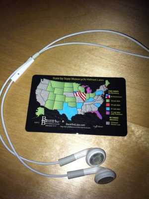
One of the best uses for an infographic we've worked on lately was this wallet card from Buckfire & Buckfire. Based on the U.S. Motorcycle Helmet Laws infographic, we created a smaller image of just the map visualization. Buckfire had them printed up onto plastic cards the size of a credit card, and made them FREE to anyone that requests one using the form on their page.
The visualization is a great reference to motorcycle riders across the country, and making them FREE and easy to carry in your wallet was a brilliant marketing strategy. For many motorcycle riders, the card will be a handy reminder as they cross state lines, and nothing more. However, with the Buckfire name, logo, phone number and URL on the cards, if any of these motorcycle riders happen to need a lawyer, the credibility and good will generated by these cards might bring the Buckfire Law Firm to mind.
This project was a great example of bringing data visualization into the real world, making the visualization relevant and informative to their target audience, and instead of looking at the infographic online just once, the target audience could potentially carry around the design with them constantly.
It's also a design with a long "Online Lifespan". Instead of designing the infographic about a current, trending news topic, this design visualizaes information that will be relevant for years.
